Web Sites > Connectrix 2015
At the time this version of their website was built, Connectrix provided only Business and Home Automation services.
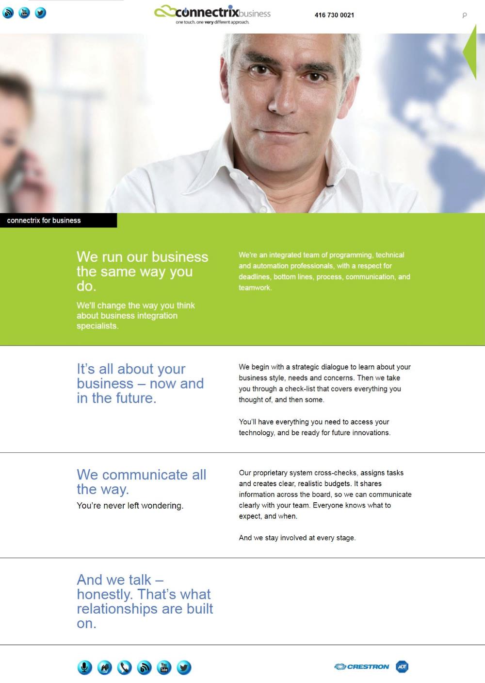
This version of the responsive website was built for Connectrix, under the direction of the project-manager/designer they had hired. She wanted all banner images to appear full width, and full height above the fold. Before the official launch, the owner of Connectrix rejected this design, and wanted to show the body text as well. Another team was engaged to redo the site wihout meeting with me first.
I created a custom theme that uses only one template to display all the site's pages, except the contact form and search pages that use different custom templates. The template script knows which background colour to use for the different site sections, and makes it easy to edit existing pages and create new ones.
The site uses my search engine, MySpider, instead of the Wordpress search feature.
The slide show for some banners is my own creation. It gives the site Admin better control of which images are used than a plugin would. When more than one image is added to a page's banner in the Edit Page Admin area, the slide show is automatically run. For example, the client may want to display the different possible audio setups on a particular page. The Admin just has to upload the desktop and mobile images, named for example, as "great_sound.jpg" and "great_sound_mobile.jpg". Only the name of the desktop image file, "great_sound.jpg", has to be added to the contents of the page.
My PHP script sets page specific key search terms for each page's title tag for Search Engine Optimization (SEO).
I created clickable areas in the Home page's background image, on the desktop and tablet versions, that link to the three main sections' landing pages. My solution was more complex than simple image maps which would not work with a responsive background image.
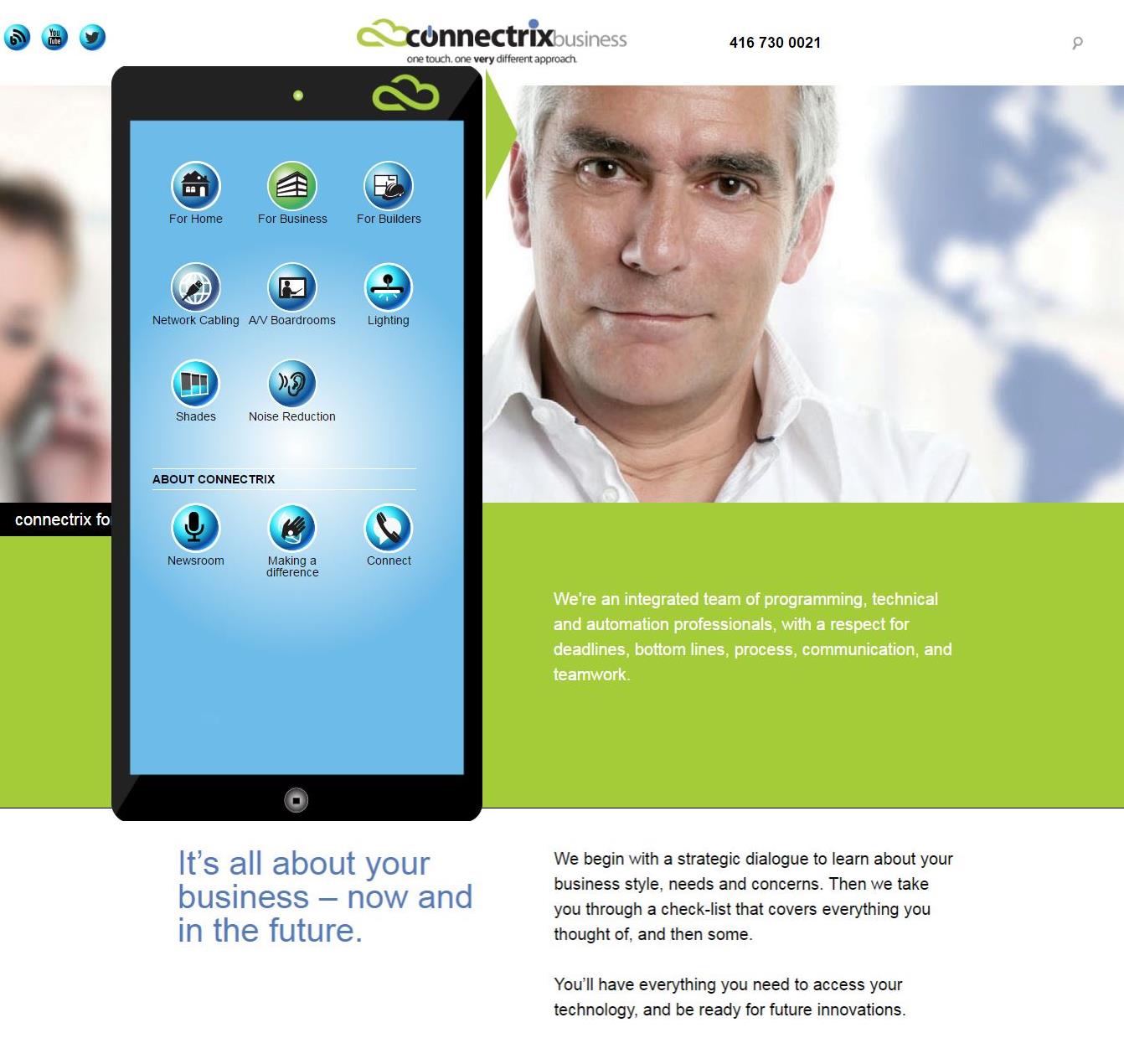
As requested, I created the popup navigation menu, to mimic a tablet's home screen. The navigation items and their sub-items resemble app icons. As different main navigation areas are selected, only that area's sub items are displayed. And when a sub item is selected, it and its main nav item icon are rendered in green, indicating to the user where they are in the website.
The contact form page template includes code and a cookie to update, maintain and display all the data the user had entered when returning to the form page after having left it to visit other web pages. Even the data entered in a multiple selection dropdown menu is maintained and automatically selected on reloading the form page.

Questions about your web project?
Please call me now at416-530-0070.
Please call me now at